Intro
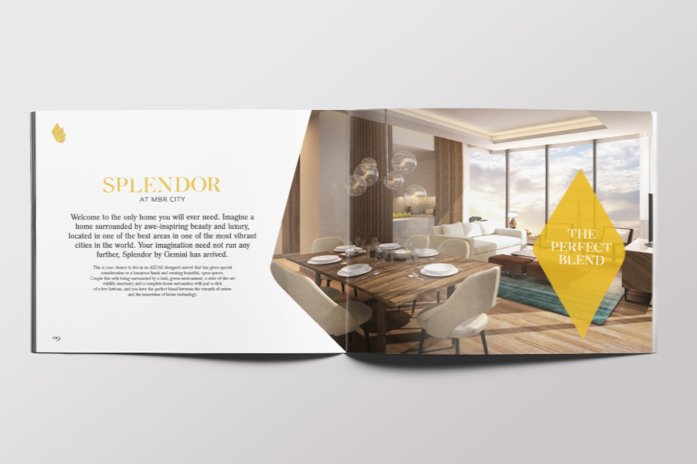
Gemini Splendor is the definition of modern urban living surrounded by nature and the stunningly landscaped community in Mohammed Bin Rashid Al Maktoum (MBR) City. With the promise of combining tranquil living with modern connected lifestyle Splendor offers the perfect combination for a modern home owner.
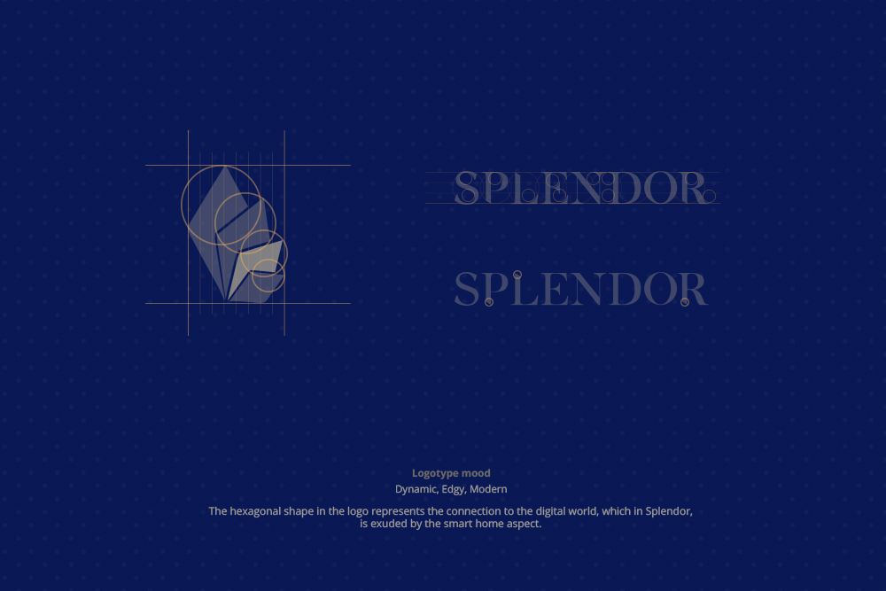
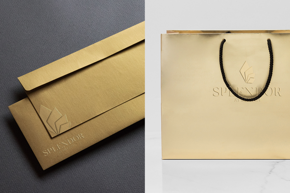
Through the use of shape and color, the logo creates an amalgamation of what Splendor stands for. The hexagonal shape in the logo represents the connection to the digital world, which in Splendor, is exuded by the smart home aspect. When coalesced, the collection of hexagonal shapes outlines the contour of a flamingo, also represented by the pink in the logo. The idea of using a flamingo theme in the logo is linked to the sanctuary aspect of Splendor.
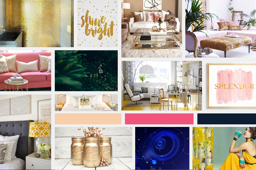
The gold in the logo is used to represent the opulence and stylishness of the living space. Furthermore, it instills the confidence and trust that is needed from the target audience. All this is projected on a white backdrop which brings about a sense of balance and structure.
Services
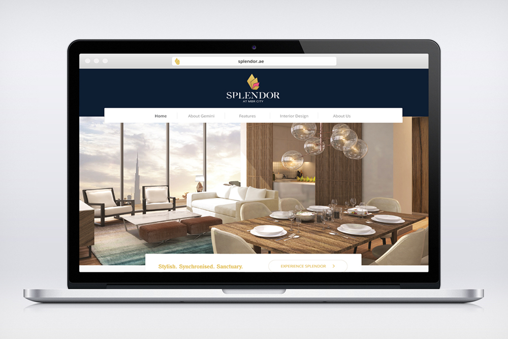
Brand Development, Design Strategy, Web Design
Clients
Splendor Residences, Dubai
Reflection
The combination of the shapes and colors will reinforce the idea that residents of Splendor will be a stylish synchronised sanctuary.

